
Analysis: Responsive themes vs Mobile plugin
Responsive themes vs Mobile plugin
One of the most recurring questions I got from clients for the last year is about the pros & cons of responsive themes vs our mobile plugin for classipress. Sometimes also mobile native apps are part of the question. I’m gonna focus my analysis basically for smartphones but not for tablets.
In this post I’m gonna try to explain my thoughts about these options to offer classipress/ users a mobile solution.
Responsive themes
Basically are a set of CSS instructions to adjust the CSS elements according to the screen size. Sometimes those elements are resized/moved and other sometimes are simply hidden or overwritten by a mobile friendly control. There are a lot of themes using this technique, like classipress since version 3.3.
Pros:
- Mobile and desktop layout has similar look and feel, but not the same. So we can say that layout is more or less consistent in color scheme, fonts, etc.
- No third party software installs are required
Cons:
- Performance is usually poor compared with mobile web plugin/app, unless you have a powerful server. The mobile version has to execute the same php code than the desktop site, including plugins, etc. Most of this code is completely useless in mobile environments and overloads the amount of code to execute without any real benefit to the mobile user.
- Active plugins not not designed as responsive will produce layout issues and errors.
- Mobile and desktop layout is similar but not the same (yes, that’s a good and bad point at the same time :)). In responsive designs, due to the screen size limitations some typical elements has to be reallocated, so for example the classic sidebar usually is moved down or even will disappear. Maybe an experienced WP user can figure out were are the widgets, but not newbies. So this becomes an usability problem.
Mobile web application
A mobile website is similar to a regular website and can be accessed with the help of different browsers, the only difference being it is created for small-screen devices. Mobile sites are optimized for on-the-go users, contain limited (or rather, necessary) content and are lighter and faster than responsive websites. Our Cpmobile and Cpmobile Pro for classipress is an example of mobile web applications.
Pros:
- Usually are 3-4 times faster than responsive sites. That’s critical when your users are running a 3G/EDGE connections. The mobile web app only runs the necessary code and also this code is usually very optimized to improve the user experience even with slow internet connections.
- Easy installation. It depends on every case, but for instance, our mobile plugin for classipress, a regular plugin installation is all what you need to offer your mobile users a better experience when they are running your site.
- Ability to customize the mobile web app or the mobile separately. You can customize your desktop web site and all the customizations will not be propagated to the mobile app and viceversa. This gives you the power to offer different functionalities depending on the device. That’s important because the action you usually do in the site with your mobile device (in the street, a coffeeshop,etc) are very different than the actions you need to do in your site when you are in your desktop.
Cons:
- The layout is not exactly the same in the mobile web app and desktop site.
- Some plugins will require to be adapted to the mobile web app. That’s the same problem we mentioned for responsive themes, third party plugins will n to be always compatible
Performance analysis
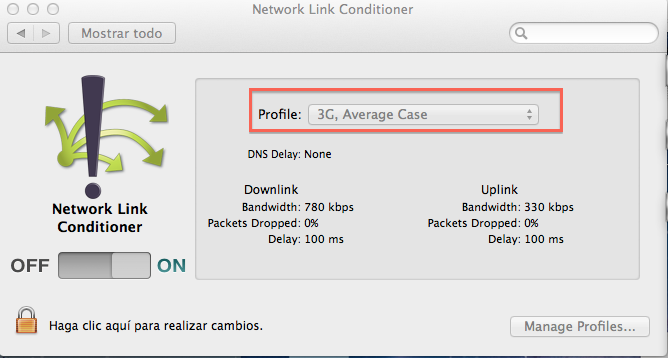
All you tests has been done in the same server and in the same conditions.
Network link details for testing
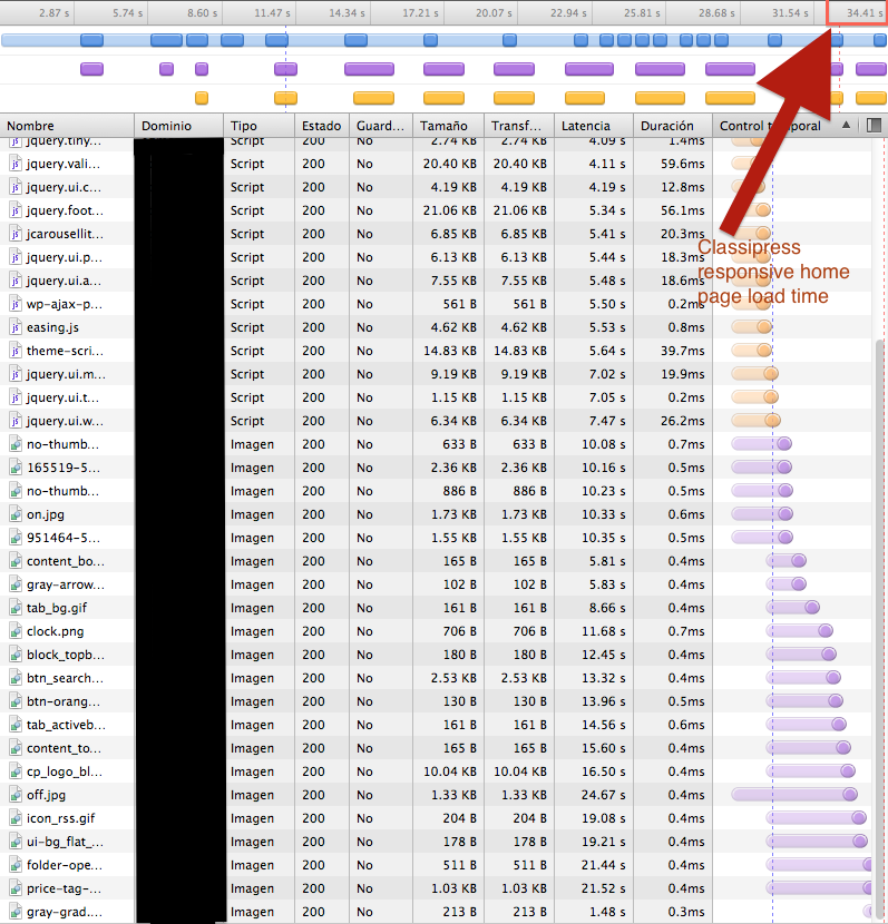
Classipress responsive home page (Apple iPhone 5 simulator)
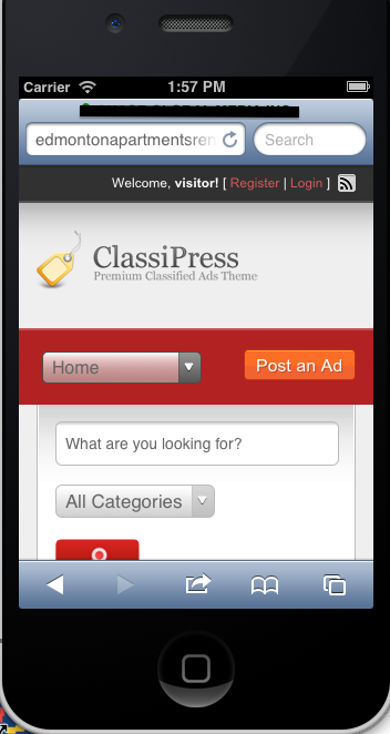
Performance chart for classipress responsive
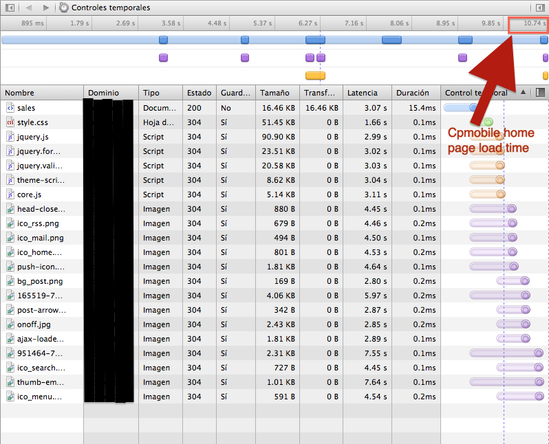
CPMobile Pro home page (Apple iPhone 5 simulator)
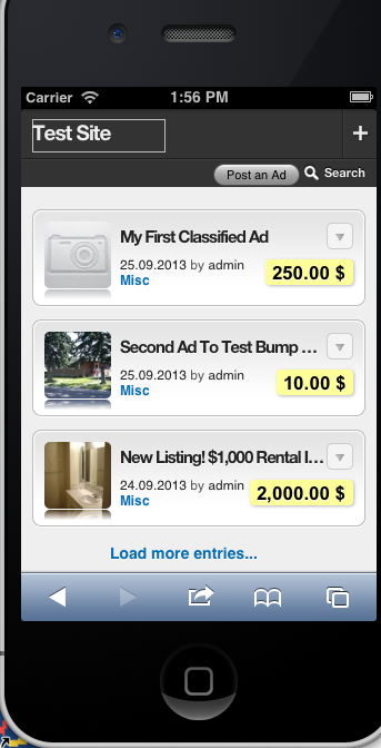
Performance chart using Cp Mobile PRO
Conclusions
Every site and every client has usually different requirements, so there is not a magical solution to fit the need of all classipress users. Responsive design can be a good solution if is important for you to offer your clients a similar look for desktop/mobile or even if your users are always connected using Wifi connections. If performance and user experience is important for you and your clients, then you will need to go beyond responsiveness and offer your clients a complementary option. In this case, happily for our clients our mobile plugin can do the job because they can switch from the fast mobile web app to the standard classipress view using the front end switcher link, so they can enjoy the best of both solutions depending on their conditions and needs at any moment.
Chris
07/07/2014 @ 19:36
Hi will this work with child themes like headline?
alucas
08/07/2014 @ 10:02
Hi Chris
Yes, it works with any childtheme ;)
Regards